
Flo Redesign
Flo is a holistic health app that allows you to track your period, symptoms, chances of pregnancy, and your baby’s growth and development. Additionally, Flo provides insights into body signals, evidence-based health articles, and much more.
Role
UX Project Lead (Insights)
Tools
Figma, Figjam
Timeline
Feb. - May 2024 (12 weeks)
Team
Jade (Co-Lead), Adeline, Amy, Kaiti, Isabella
The Problem
Flo’s design limits accessibility by using exclusive language and branding, which alienates a broad range of users. The app’s tone fails to resonate with users who find it dismissive of the diverse realities of menstruation. Additionally, a restrictive paywall structure further hinders access to essential health resources, reducing the overall user experience and inclusivity.
Our Solution
Our solution created a more inclusive and accessible app by allowing users to customize profiles and updating the design to be neutral and empowering. We restructured the paywall for better access to essential resources and enhanced the interface to promote a holistic health experience beyond period tracking.
Research
So, How Did We Get There?
Our research began with an analysis of various apps, including Clue, Apple Health, Glow, Ovia, Clover, and Stardust. We found significant differences in inclusivity: Clue, Ovia, and Stardust excelled, while Flo, Glow, and Clover struggled. Apple Health offered a generic experience due to its lack of identifiable UI. Most subscription-based apps, except Stardust, lacked transparency about free versus paid features. We also evaluated privacy practices, discovering that some apps, like Flo, Glow, Ovia, and Stardust, have previously sold user data, despite their privacy claims.

Understanding Our Users
We chose to interview 12 individuals who menstruate, as each person has their own unique, personal experience. We based our questions on inclusivity, privacy, and their experiences with the paywall. Alongside interviews, we sent out a survey, reaching an additional 12 individuals. From here, we clustered our information using affinity mapping.


Ideate
Sporty Sam’s & Inquisitive Indigo’s Troubles
To bring our insights to life, we developed user personas that represent the diverse experiences and needs of Flo’s users. Each persona embodies key characteristics and behaviors derived from our research, helping us to empathize with users and guide our design decisions. Alongside this, we mapped out their journeys and identified possible issues they may encounter. This process allowed us to come up with opportunities for improvement through ‘how might we’ questions.


Navigating the Experience
After understanding our users' needs and frustrations, we restructured the information architecture. The primary change involved removing the Messages and Partner pages in favor of prioritizing the Profile page. This allowed users to more easily access key features that were previously hidden, streamlining navigation.

Design
Sketching Out Basic Ideas
With all our research in hand, we began the design phase by creating low-fidelity sketches. Each team member focused on two to three parts of the navigation bar and drafted multiple ideas. This collaborative process allowed us to combine our concepts and engage in discussions about our thought processes, ultimately helping us pinpoint key features that effectively addressed our insights.


Visualizing Features
Building on our sketches, we created mid-fidelity screens to refine and develop our design concepts. This phase allowed us to combine ideas from the sketches and iterate on new concepts through ongoing feedback and collaboration. Below are some of the key screens we developed.


Testing
While we were still in the mid-fidelity phase, we conducted a round of user testing with 12 users. Our user tests revealed that participants found our screens more intuitive and appreciated the inclusive language used thus far. However, we also identified that users had difficulty with icon placement, such as the edit icon on the 'Edit Interests' page and the AI chatbot button on the ‘Secret Chats’ page. Additionally, users were confused on how to close the Premium Ad.
Final Mockups
Onboarding
Redesigned onboarding to include questions about pronouns and gender identity.
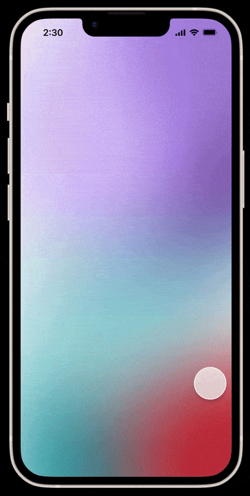
Replaced pink flowers with a gradient to move away from feminine imagery.
Home
Designed the home page to encourage logging symptoms, mood, and important information.
Added customizable color schemes to match user preferences.


Insights
Improved transparency between paid and free content, especially on the insights page.
Redesigned the premium subscription ad to take up only half the screen, reducing disruptions.
Updated article images to be more inclusive of different genders and races.


Secret Chats
Added an option to edit interests for greater customizability in Secret Chats.
Moved the Messages tab into Secret Chats, as it was rarely used.
Clearly labeled Messages as a paid feature to improve transparency.


Profile
Made key features like goal setting, graphs, and reminders more accessible.
Added a clearly marked free section for partners to avoid paywall confusion.
Separated free settings from Flo Premium options for better clarity.
Simplified lifestyle adjustments to improve app predictions.


Growth
What’s Next?
If we had more time, my team and I would have liked to do more prototyping instead of just focusing on key interactions. This would have helped us explore more parts of the experience and make sure our designs worked well interacted well.
Personal Reflections
Co-leading vs. solo-leading
The transition from solo-leading to co-leading was a bit challenging. Initially, I found it difficult to split the role as I was used to having all of the control. However, I wanted to create a space for my co-lead to grow and develop her leadership skills while feeling supported. Through open communication and a bit of practice, my co-lead and I found a dynamic that allowed both of us to grow and play into our strengths.
Importance of secondary research
A key part of this project was improving gender inclusivity for non-female identifying users. We were only able to interview a few individuals who were non-female identifying. To supplement our interviews, we conducted secondary research to ensure we accurately represented all perspectives. This experience highlighted the importance of secondary research, which gave us essential insights when user interviews were limited.
Questions?
If you have any questions or comments about this project, feel free to contact me either via email (angelahukic.design@gmail.com) or LinkedIn.