
Letterboxd Redesign
Letterboxd is a social network platform for film enthusiasts. The platform allows users to log and review movies they’ve watched, create watchlists and collections, and follow friends to see what they’re enjoying.
Role
UX Project Lead (Activity Page)
Tools
Figma, Figjam
Timeline
Sept. - Dec. 2024 (11 weeks)
Team
Sarah (Co-Lead), Adeline, Brianna, Ellen, Tejas
The Problem
Users struggle to discover niche films and build deeper connections due to limited community features and insufficient filtering and sorting tools.
Making film discovery more accessible by highlighting niche movies, strengthening social features, and refining filtering and sorting for better exploration.
Our Solution
Research
So, How Did We Get There?
Our analysis compared platforms like IMDb, Trakt, Metacritic, Goodreads, Last.fm, and Reelgood. IMDb and Metacritic stood out in discoverability and filtering tools, while Letterboxd and Trakt excelled in reviews and social features. Navigation was strongest on IMDb and Goodreads, but platforms like Letterboxd and Reelgood showed room for improvement. Personalization was a common gap, with IMDb, Goodreads, and Last.fm excelling.
Understanding Letterboxd’s Users
We conducted interviews and surveyed 15 individuals who varied in how frequently they used the app. Our questions focused on film discoverability, reviews, and their experiences navigating and utilizing the app's essential features. From here, we clustered our information using affinity mapping, allowing us to find common trends and discover our main insights.
Ideate
Indie Isaac’s & Picky Priscilla’s Journeys
Indie Isaac represents Letterboxd’s largest age demographic (18-24), with his struggles highlighting the need for better indie film discovery and social engagement. The platform prioritizes popular films, and limited filtering and community features make it harder for users like him to connect and explore. Picky Priscilla represents users who seek a more polished and organized Letterboxd experience. She finds the platform’s design repetitive and its features scattered, making navigation overwhelming. Additionally, she struggles with cluttered lists and disengaging community interactions.
Organizing the Experience
We focused on creating a clear and intuitive information architecture to help users easily discover and access both existing and new features. Through our research, we found that users had difficulty locating certain features, so we reorganized elements and introduced new features to address these pain points. Our goal was to streamline navigation and ensure all features were easily accessible.
Design
Sketching Out Basic Ideas
With all our research in hand, we began the design phase by creating low-fidelity sketches. Each team member focused on two parts of the navigation bar and drafted multiple ideas. This collaborative process allowed us to combine our concepts and engage in discussions about our thought processes, ultimately helping us pinpoint key features that effectively addressed our insights.


Visualizing Layouts
Using our sketches, we developed mid-fidelity screens that refined our design concepts further. This phase allowed us to merge ideas from our sketches and generate new concepts based on the continuous feedback we provided each other. Below are some of the key screens we created.


Testing Our Ideas
During the mid-fidelity phase, we conducted a round of user testing with 12 participants. Testing at this stage allowed users to focus on the functionality and placement of key features rather than the app's aesthetics. The tests revealed that users found our screens more intuitive and easier to navigate. However, we identified that users struggled to understand the purpose of the 'Upcoming' tab on the Activity page. Additionally, some buttons were difficult to interact with due to their size.
Final Mockups
Onboarding
New users can personalize recommendations during onboarding.
Customization includes genres, languages, and streaming services.
Users can also input movies they have previously seen.

Home
The Home page features diverse film categories beyond "Popular This Week."
Users can discover new films based on their interests.
Enhanced filtering in Reviews and Lists tabs allows for quick content personalization.

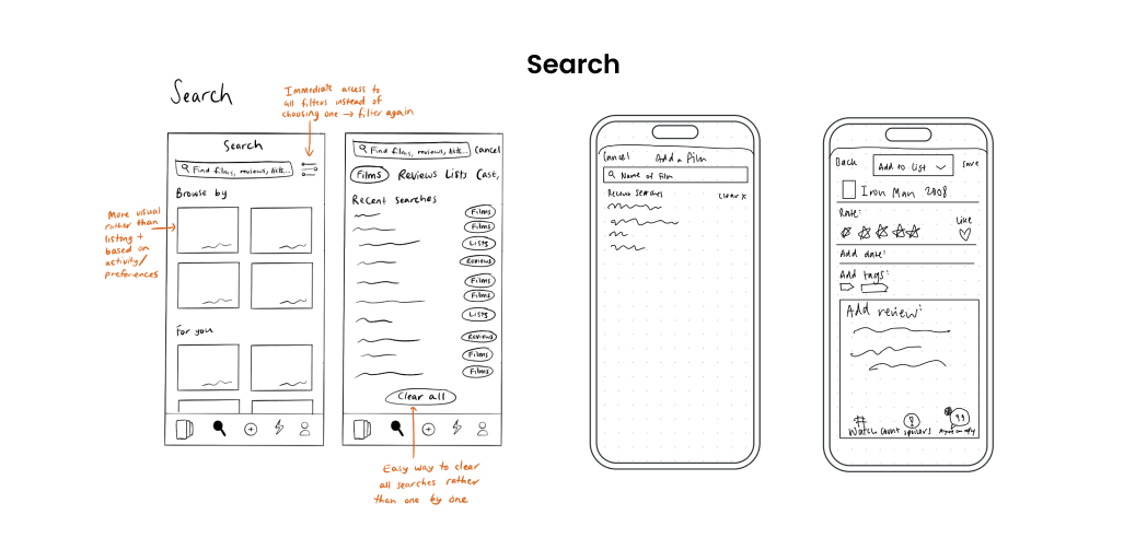
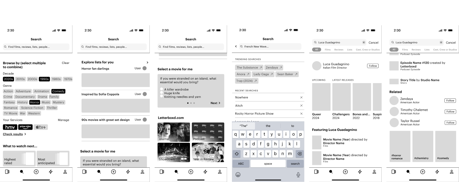
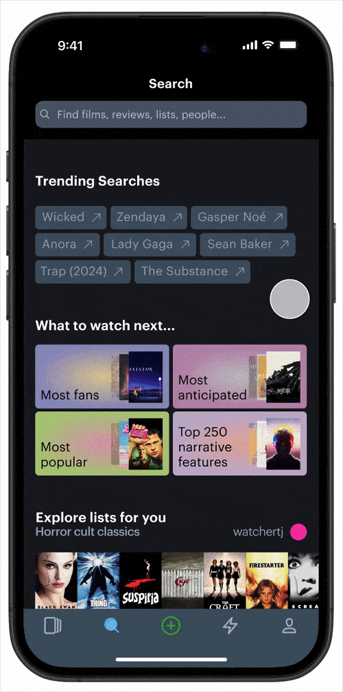
Search
The search page features trending searches and a dynamic search bar with rotating suggestions.
Users can take a short quiz for personalized recommendations.
Search now yields relevant results, including director profiles, upcoming releases, lists, and a follow option.

Search Filtering
Robust filtering options help refine searches more effectively.
Filter by decade, genre, and streaming service to find relevant results, with options to refine further by films, lists, reviews, and more.

Film Page
The film page shows how well a movie matches a user’s preferences, with expandable details.
Reviews, Lists, and Members are now more prominently featured for better visibility.
Users can start comment threads under reviews, making conversations easier to follow.


Add a Film
More tag options in the "Add a Film" section.
Includes frequently used tags and personalized suggestions based on the film.
Helps users better categorize and share their experiences.

Activity
Improves notification clarity and relevance.
You tab highlights interactions with your reviews, comments, and followers—removing redundant notifications.
Updates tab replaces Incoming, focusing on favorite films and actors.
Interest filtering lets users customize notifications based on their preferences.

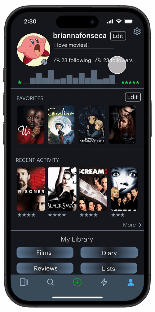
Profile
Easily update profile picture, favorite films, and display name directly from the profile.
"My Library" is now more prominent, providing quick access to diary, reviews, lists, and films.
Revamped settings for a more intuitive and user-friendly experience.
Growth
What’s Next?
If we were given more time to work on this project, our team would like to conduct a second round of user testing with our high-fidelity prototypes. This would ensure the changes we made from our first round were implemented correctly and are desired by users.
Personal Reflections
Co-leading while being co-president
While co-leading this project, I was also serving as co-president of the organization. Balancing my responsibilities as co-president with designing and leading a team was challenging, but ultimately rewarding. I was fortunate to have an incredible co-lead, co-president, and team of designers who made the experience less overwhelming. This experience taught me the importance of leaning on others when needed and not being afraid to ask for support.
Fresh perspectives
Before this project, I had never used Letterboxd, which initially made me doubt my ability to contribute effectively to the redesign. After some time, I realized that not being a user gave me a fresh perspective, allowing me to focus solely on what users actually wanted without being influenced by personal biases. This experience highlighted the value of approaching design with an open mind and reinforced the importance of relying on user research to guide decisions.
Questions?
If you have any questions or comments about this project, feel free to contact me either via email (angelahukic.design@gmail.com) or LinkedIn.